SatRday
From the 16th to the 18th of February, satRday was held in the City of Cape Town in South Africa. The programme kicked off with two days of workshops and then the conference on Saturday. The workshops were divided up into three large sections:
- R and Git (Jennifer Bryan)
- Shiny, flexdashboard and Shinyapps.io (Julia Silge)
- Building and validating logistic regression models (Steph Locke)
R and Git
Easy integration of version control through git and Rstudio has never been this easy. If you are not already following this principle of Pull, Commit and Push in your workflow, I recommend you vist the website http://happygitwithr.com/ which will help you to correct your current workflow indiscretions!
If you are however an avid user of github and regularly push your commits with correct messages, here is a gem of a website that made my day - starlogs
Shiny
The Shiny workshop was an amazing exhibition on what can be done in an afternoon with the power of shiny and Rstudio! We got to build an interactive dashboard investigating disease data from South Africa using the new flexdashboard.
Training Models
Once a again I realised how powerful the caret package can be in training and testing a wide range of models in a modular way without too much hassle or fuss. I am really keen to start playing with the h20 package after a brief overview was shown on the ensemble capabilities of the package.
The Conference
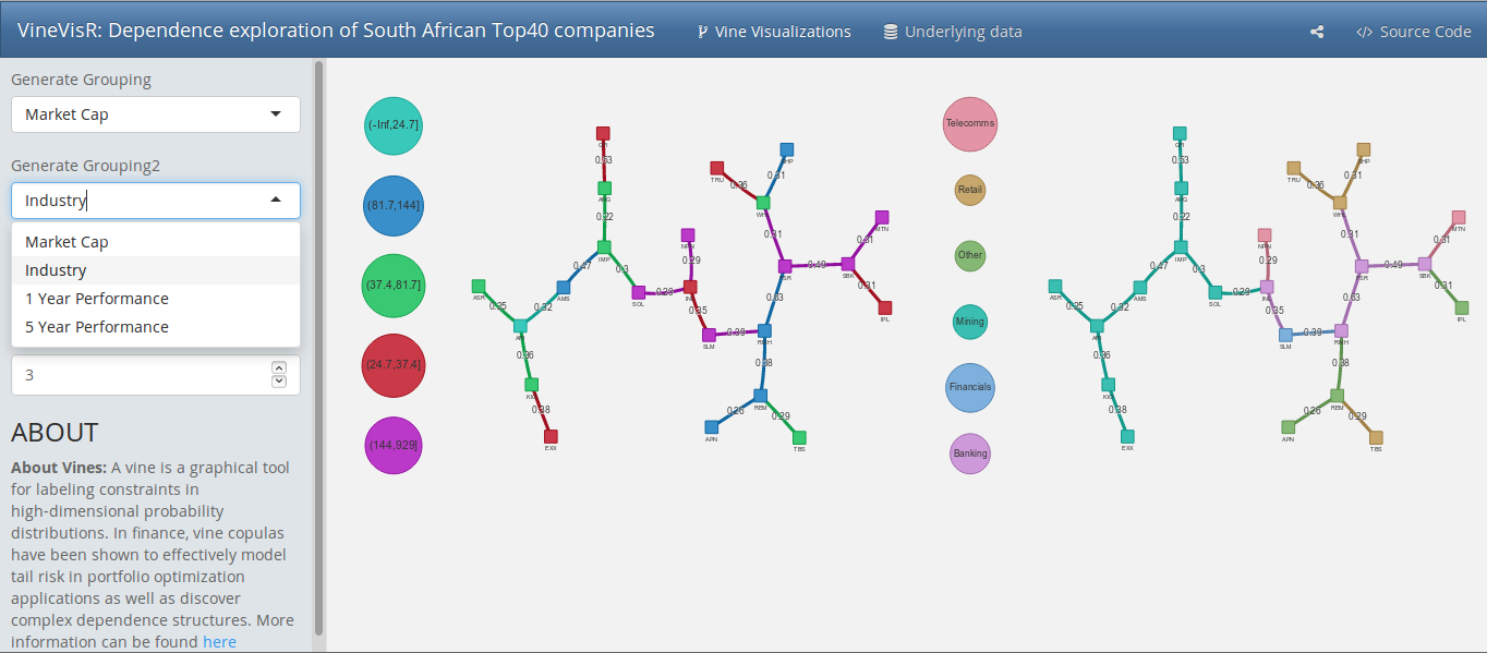
The saturday saw a multitude of speakers take the stage to discuss some of the most interesting topics and application of R that I have seen in a very long time. The full programme can be viewed on the website. I also had the opportunity to talk about how we can combine Shiny and the visNetworks html widget as a way to conduct analysis of high-dimensional Vine Copulas.
R, as an open source software with a large following provides quick and easy access to complex models and methods that are used and applied widely within academics, but more importantly, in practice. This increase in complexity both theoretically and mathematically, has resulted in an obligation from practitioners to break down walls of jargon and mathematical hyperbole into easy digestable actions and insight.
My attempt at addressing this philosophical idea was to create a small package called VineVizR. The package can be viewed and downloaded here. I used this package and its function to build a shiny App where one can explore the interlinkages between 23 of South Africa’s largest companies by market cap using Vine Copulas.
Vine copulas allow us to model complex linkages among assets, but currently the visual illustration of Vine copulae from the VineCopula package offers a bland plotting output that is hard to interpret. Combining the visNetwork html-widget along with the VineCopula RVM output, offers an interactive and visually appealing way to understand to interpret your output.
The app can be found on my ShinyApp page. I hope you enjoy this small app and the meta data that has been integrated into it. If you feel that you still want to play a bit more, go download the package and play with the VizVineR function where you can play and create your own groups!! But be aware, I don’t see myself as a developer - so when you peek under the hood and see any improvements that can be made - let me know.
View of the dashboard